LOGO
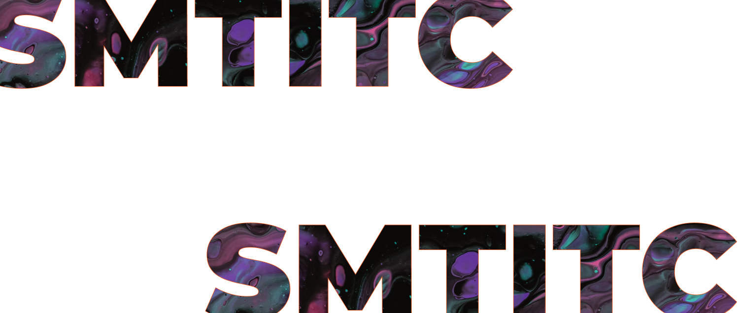
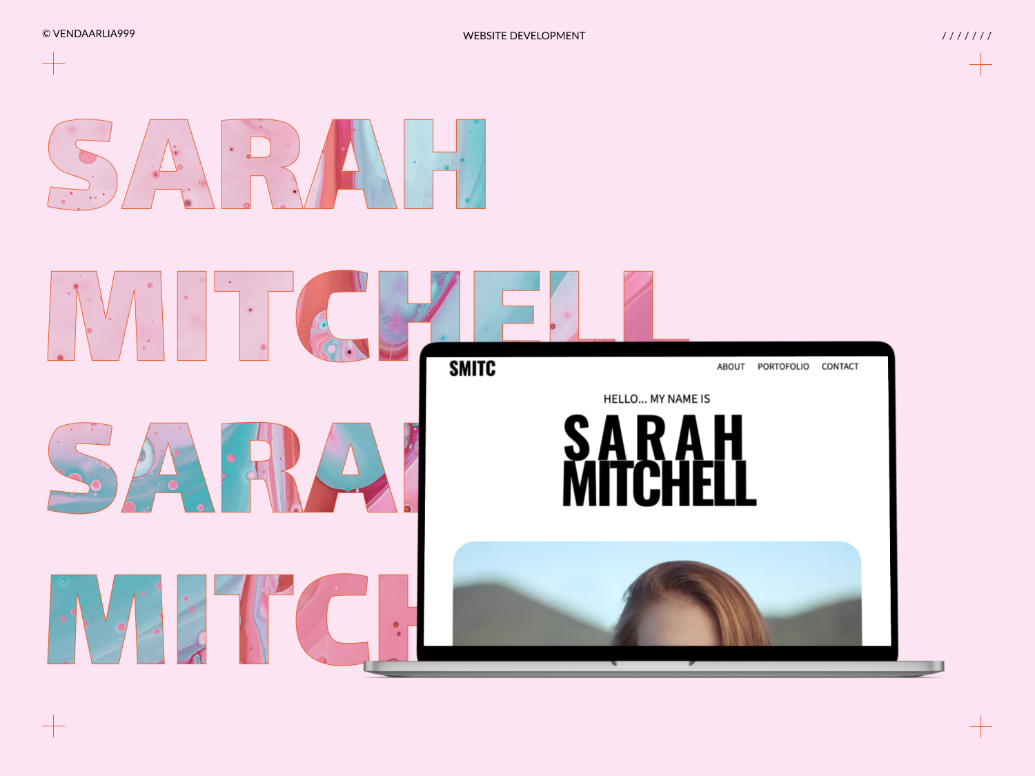
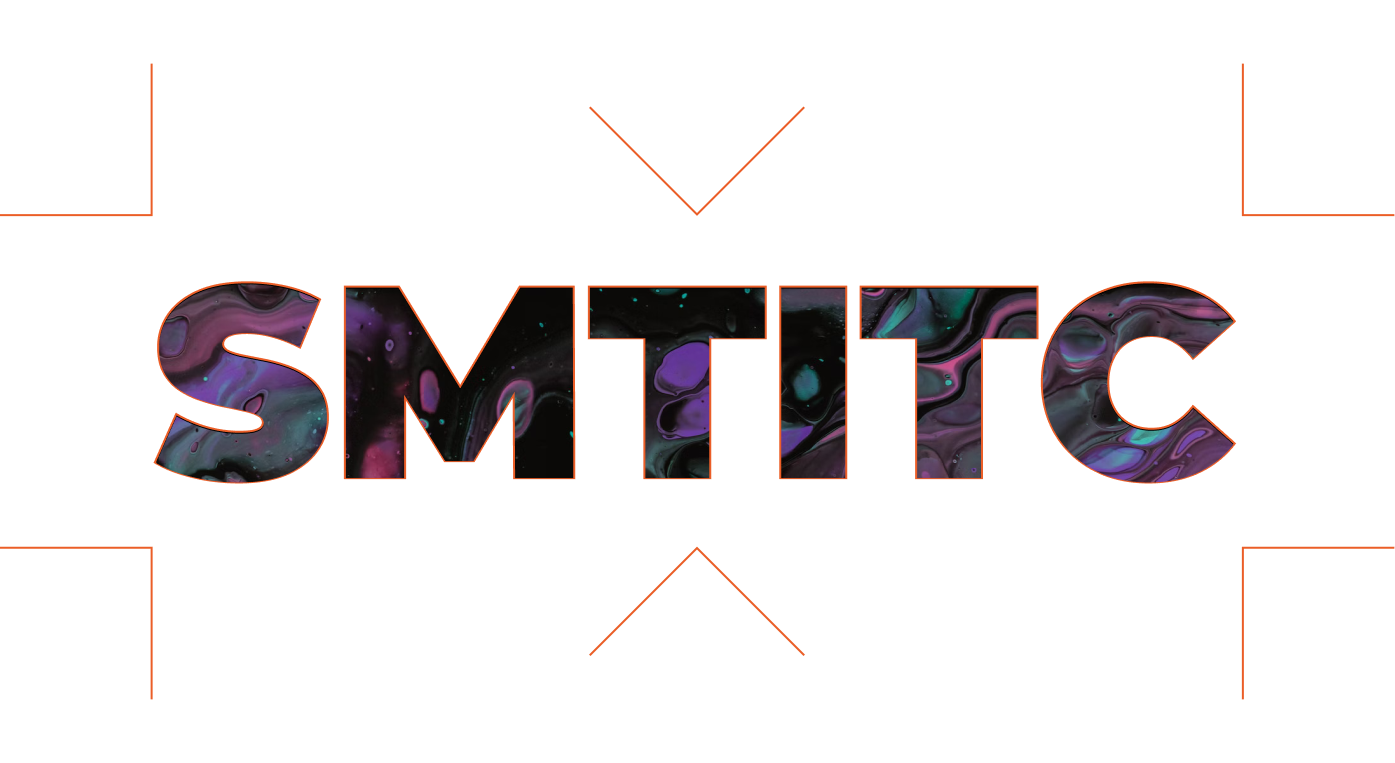
SMITC is taken from the client's name SARAH MITCHELL and a play on 'smith' instead of forging iron. The client is a color smith not to make weapons that hurt but to convey emotion.
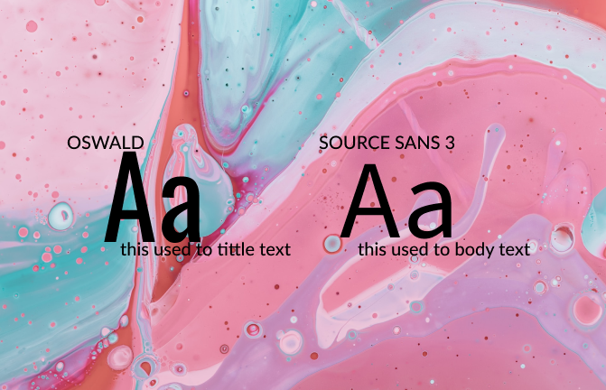
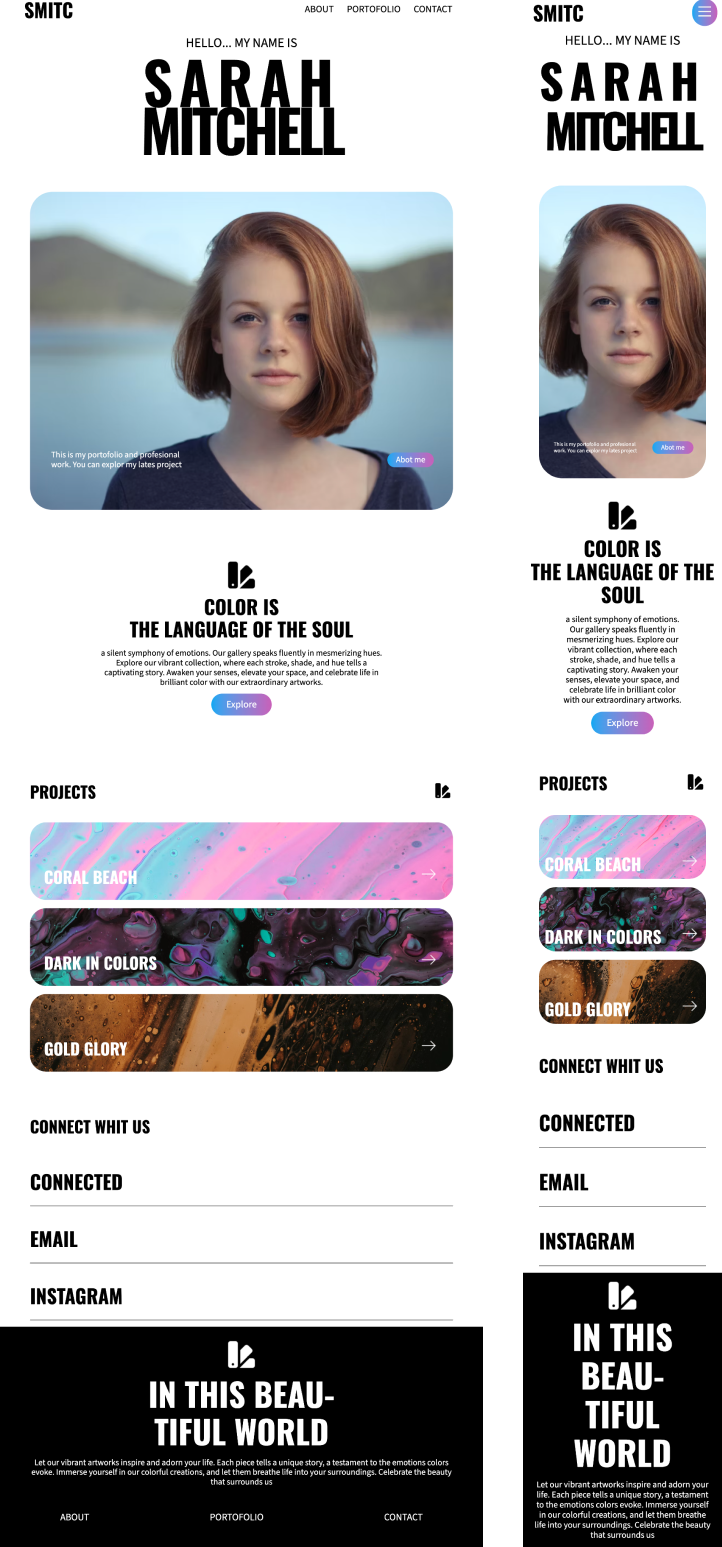
because the overall landing page design that the client wanted was minimalist and had lots of space, I used a minimalist font and had a variety of font families to meet all the accents needed, from bold to very light, available for all future needs.
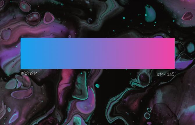
For color, I use gradient accents to blend with the client's work which is full of mixed colors. I use this gradient accent for the buttons and interaction lines below the navigation list and footer.
